




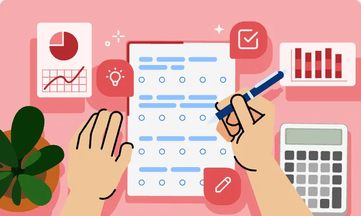


The same patterns in every government service.
Getting a whole government to share one design system
How do you get a whole government to agree on one way of building?
IDDS didn't start with a mandate. It started as my own initiative inside INA Digital, before it even had a name, and it had to earn its way to becoming the national standard.
Foundations first
Primitives and design tokens that everything else is built from.
Earning buy-in
Bringing ministries and agencies along, not forcing them.
Multi-brand
One system that still lets every agency look like itself.
Every agency was building the same things, differently.
Indonesia's digital services are built by many teams across many agencies. Without a shared foundation, each one rebuilds the same buttons, forms and tables, and every civil servant and citizen has to relearn each service from scratch.
A national standard agencies actually want to use.
A design system only works if people choose it. So IDDS had to be better for every side at once.
Ready-made, accessible components instead of rebuilding.
Each agency keeps its own identity on top.
We learned from governments that had done this before.
Before designing anything for Indonesia, we studied the national design systems that already work. Each was good at something different, and we took one lesson from each.
Accessibility notes on every component, written right next to the component itself.
Simple, jargon-free guidance that tells a beginner exactly where to start.
Patterns that solve real problems, not just a catalogue of parts.
Clear do's and don'ts, shown visually on each component.
Five pillars
That gave IDDS its structure. Foundations come first, so every page after them can point back instead of explaining again. That's the layer I built.
- Foundations
Typography, spacing, tokens, grids and icons.
- Components
Buttons, forms, tables and charts, each with usage rules and accessibility notes.
- Patterns
Sign-in, feedback, lists and page layouts.
- Real use cases
Screens from BKN, LAN and PANRB, so agencies see IDDS working in services like theirs.
- Developer guides
How to install and use it in React, Vue or plain HTML, CSS and JS.
Introducing IDDS, Indonesia's national design system for government services.
Foundations, components, patterns, illustrations and documentation for designers and developers, open to everyone at design.inadigital.go.id.
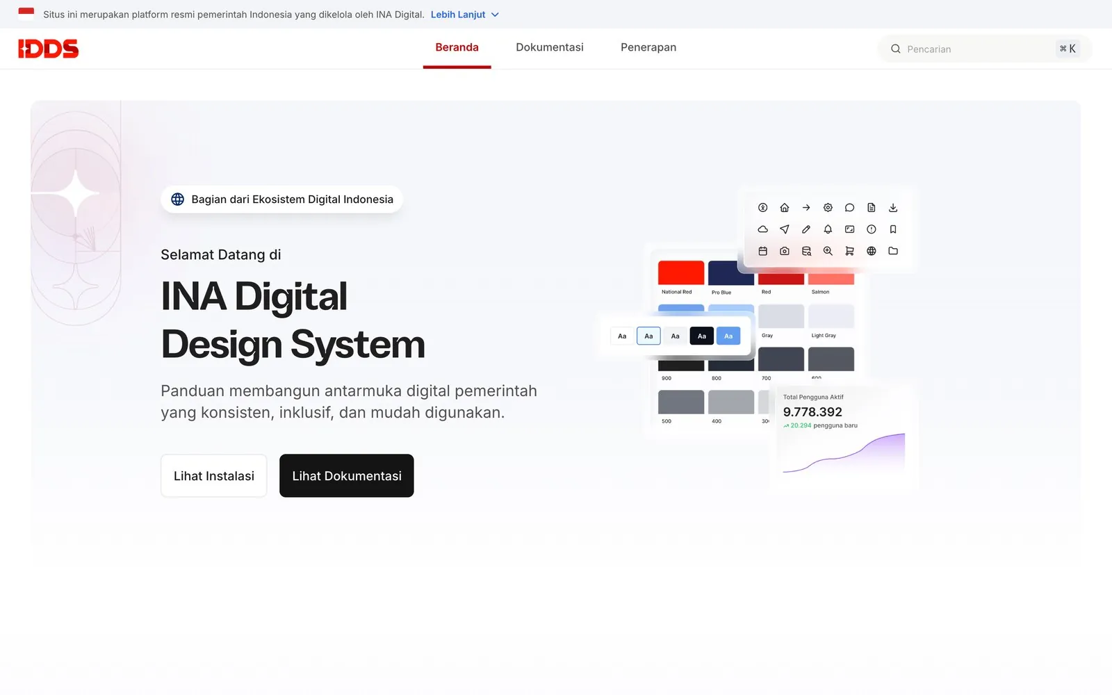
I started it before it had a name.
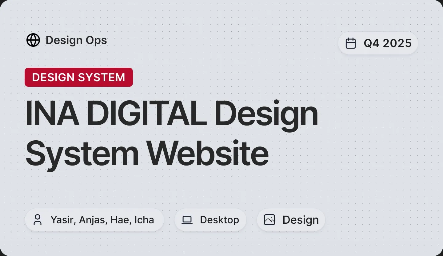
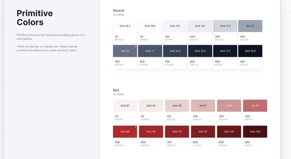
I built the first UI kit and owned the foundation underneath it: the primitives and design tokens every component is made of. Anjas and Icha joined to build components, patterns and the website with me, and we reviewed each other's work throughout.
Yasir, our Head of UX, took the initiative to leadership. That's how it reached the ministries.
What came before
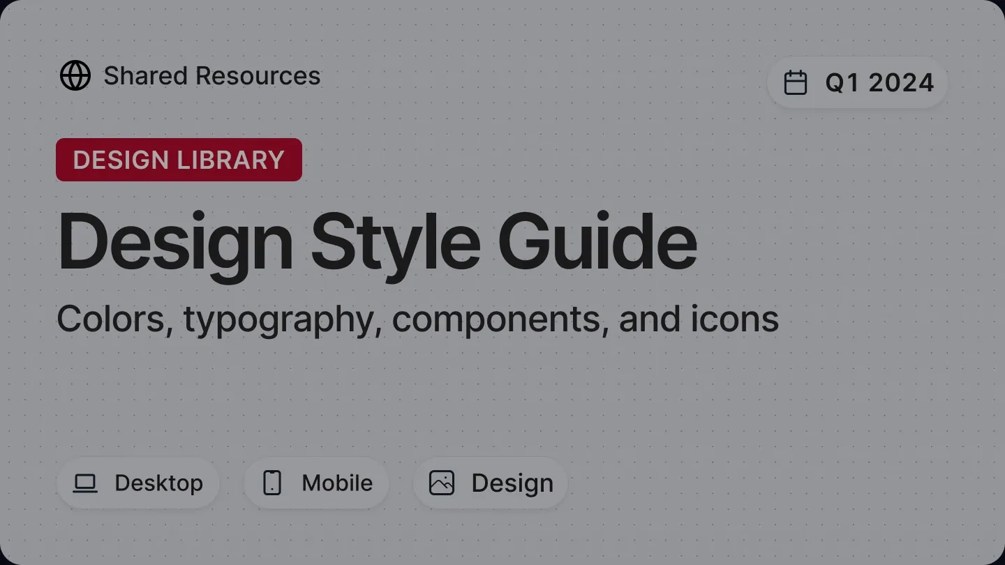
Before IDDS, INA Digital worked from a Design Style Guide set up in Q1 2024: colors, typography, a handful of components and icons. It got teams started, but it wasn't built to carry many agencies. IDDS replaced it, and the old file is now archived.
Agencies didn't want to disappear into a national system.
We needed buy-in from the ministries and Komdigi, and the pushback was always identity. A standard that made every agency look the same was a standard nobody would adopt. So we had to ask:
How much should an agency be able to change?
Their color and their logo, through tokens. The components, layouts and accessibility rules stay shared.
How do we prove it works?
Show it. The IDDS site lets anyone switch the same screen between agencies.
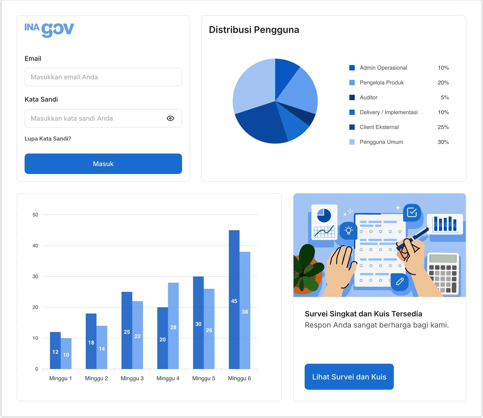
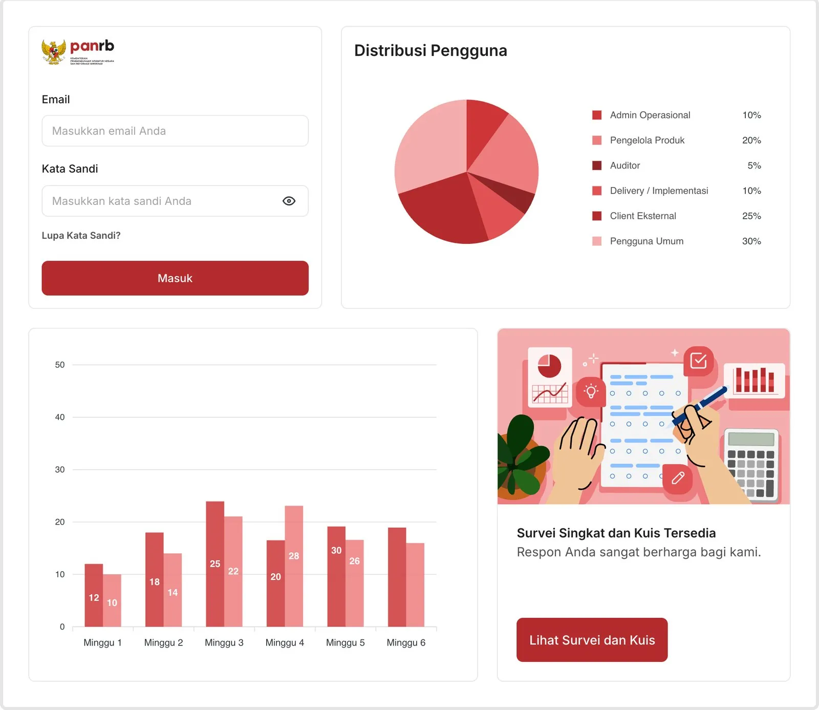
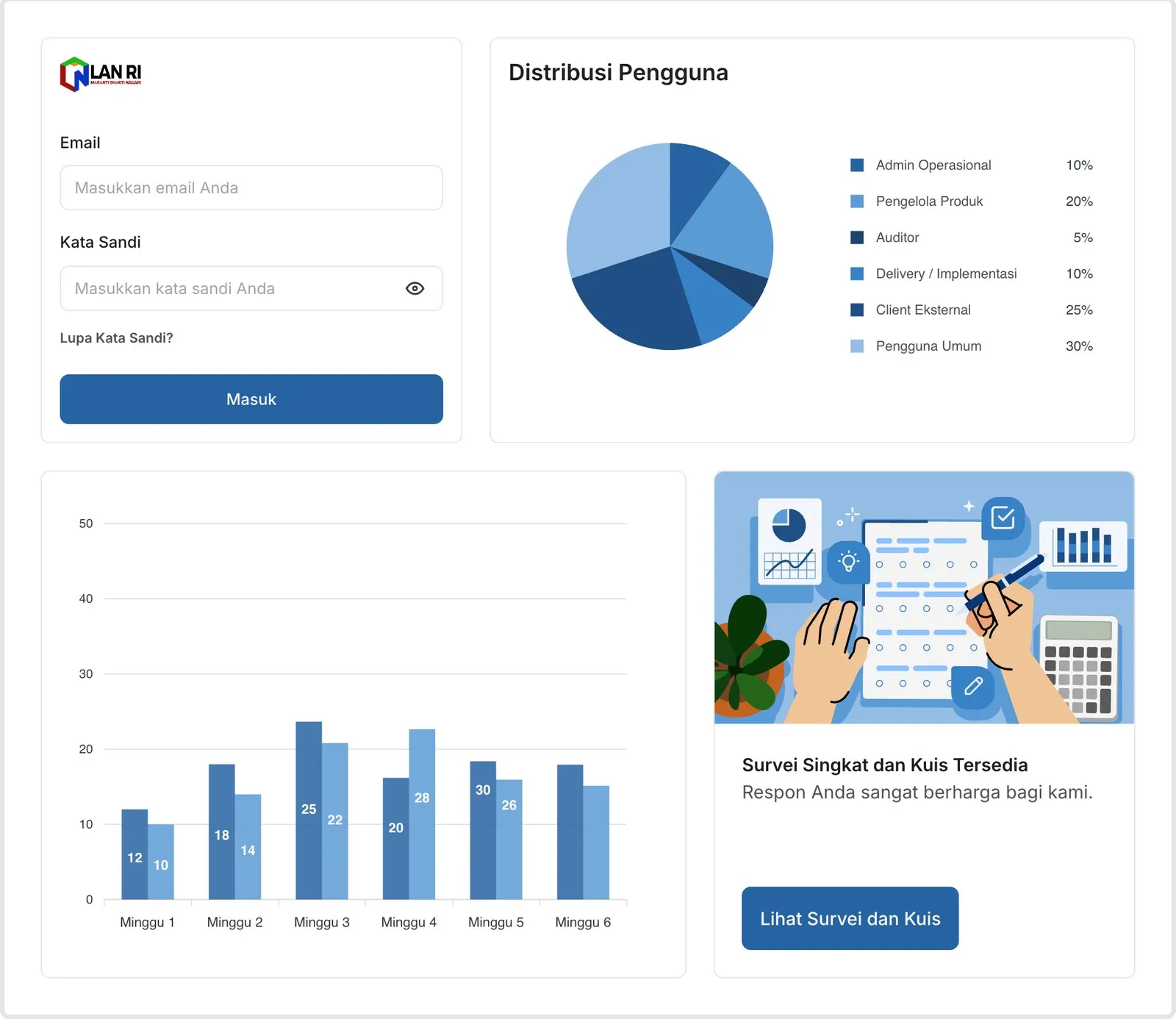
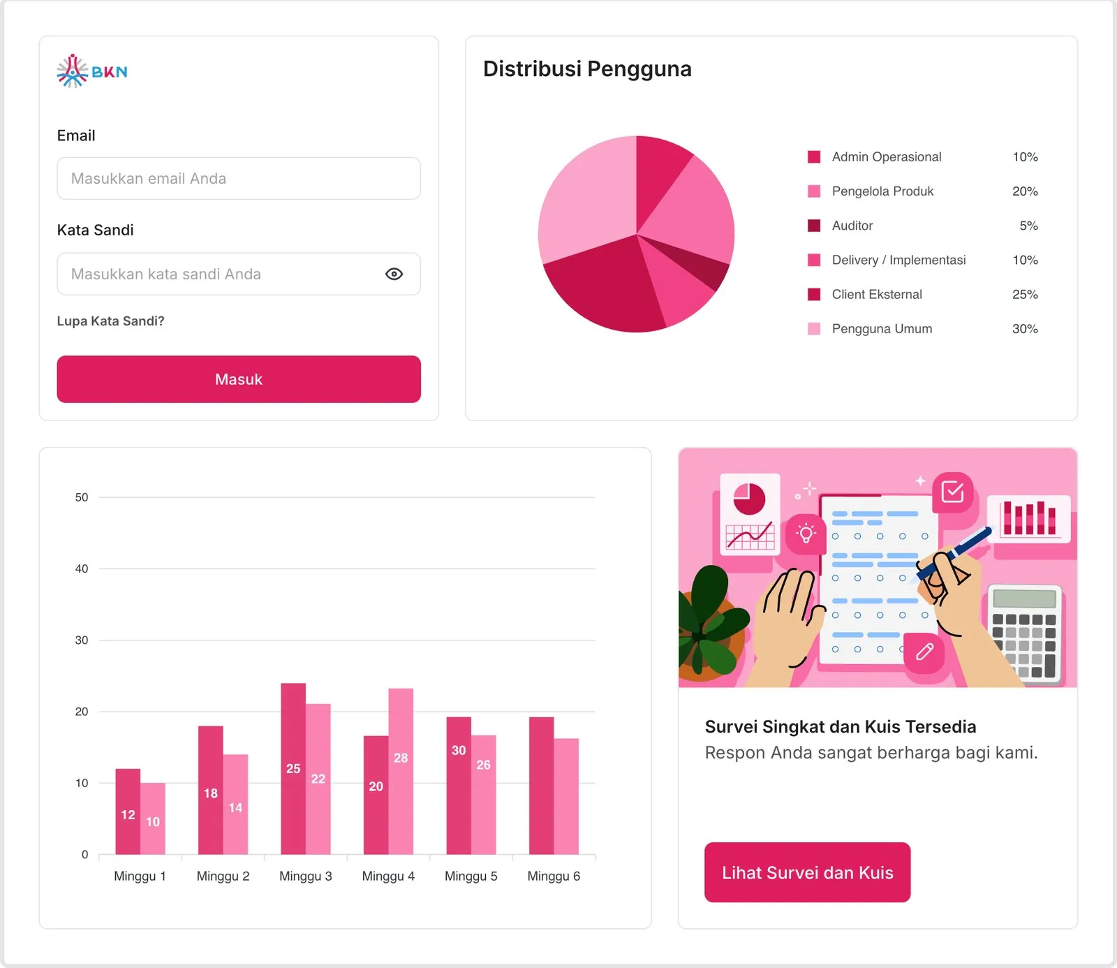
One set of components, four agencies. Taken from the live IDDS site.
We gave up total freedom so every agency could keep its identity.
Agencies can't redesign a component, but they never have to. Users get the same patterns everywhere, in their agency's colors.
A shared illustration language, too
Empty states, errors and confirmations look and feel the same across every product, each one drawn for a specific moment, from no internet to a coffee break.
 No internet
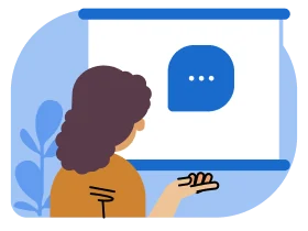 No data
 Server error
 No results
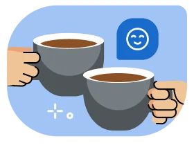 Coffee break
 Congratulations
 Confirmed
 Under construction
Accessibility lives inside every component.
IDDS follows WCAG 2.1. Before launch we audited the system ourselves, then built every finding back into the guidelines. Each component page carries its own accessibility notes instead of pointing to a separate checklist.
Color contrastFocus & keyboardSemantic rolesScreen readersReduced motion
Most teams had never tested contrast or keyboard navigation. It felt irrelevant until we showed the issues on their own screens.
We weren't speaking the same language yet.
About a month in, we realised most ministry teams had never worked with tokens, variants or component states. Some agencies had mature teams, others were starting from zero, and most were used to designing every screen from scratch. Our docs assumed too much.
So we rewrote them to be guided, example-first and in plain words. We also held checkpoints with each ministry, from workflows and information architecture to early prototypes and a final review before launch, and synced weekly with engineering so what we designed matched what shipped.
The IDDS bootcamp
The goal was for agencies to build with IDDS without us in the room. Every bootcamp (BIMTEK) session ran in four parts:
- Fundamentals
Tokens, typography, color, spacing, grids and components.
- Live demo
The Figma library in action: responsive behavior, patterns and design-to-dev QA.
- Before and after
What a service looks like without a system: three button styles on one page, uneven spacing, the same work done twice.
- Hands-on
Teams practice in Figma with the UI kit, the tokens and the docs.
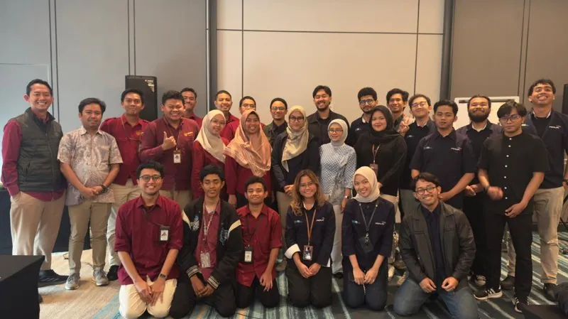
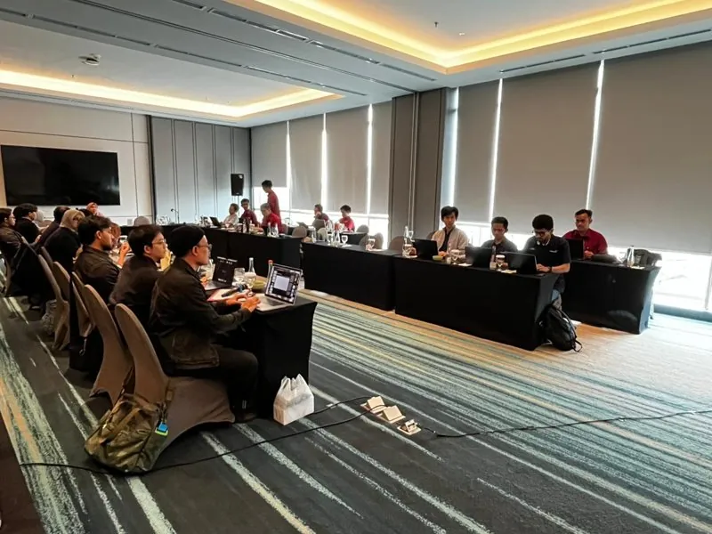
Showing the cost of not having a system won more people over than any list of features.
From a side initiative to the national standard
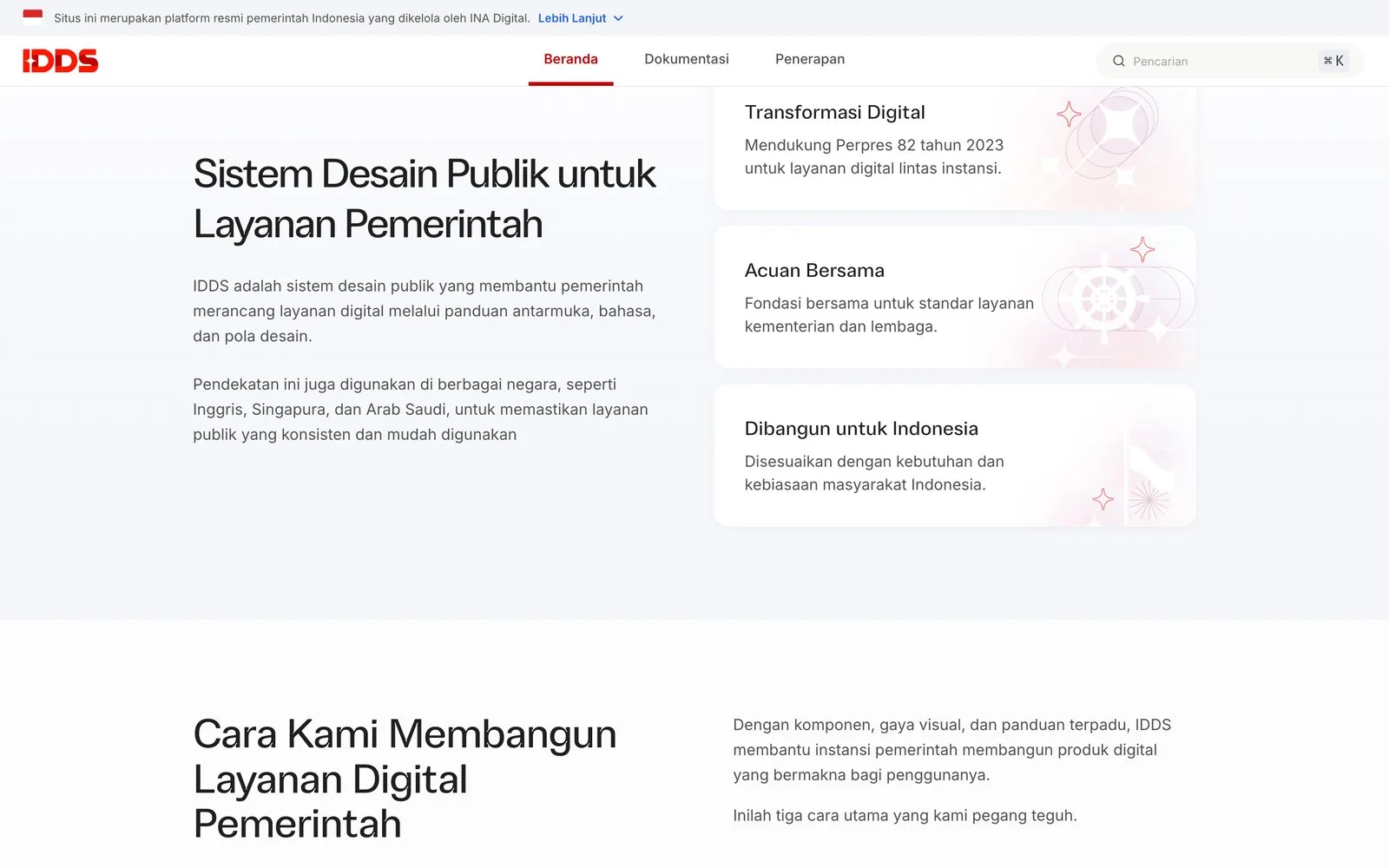
IDDS is now public, with guidance for designers and developers. KemenPANRB, BKN, LAN, BSSN, BGN and INA Health already build on it, and more are joining now that it's open.
KemenPANRBBKNLANBSSNBGNINA Health
That adoption didn't come from an announcement. It came from the bootcamps and checkpoints.
What I learned
A design system is a buy-in project
The components were the easy part. The real work was making agencies feel IDDS was theirs, not something taken from them.
Tokens are how you say yes to everyone
Multi-brand theming turned "we'll lose our identity" into "we keep it, for free."
Design
Haechal (foundation and UI kit), Harmadina Gany, Muhammad Anjas, Icha
Engineering
Annisa Utami, Umar Faruq, Muhammad Iqbal
Research and writing
Evan Gilang (UX research), Allan Pringadi (UX writing)
Leadership
Yasir, Head of UX