admins I interviewed didn't know Task existed. It was tucked away in the bottom bar.
Making approvals impossible to miss in Jack's mobile app
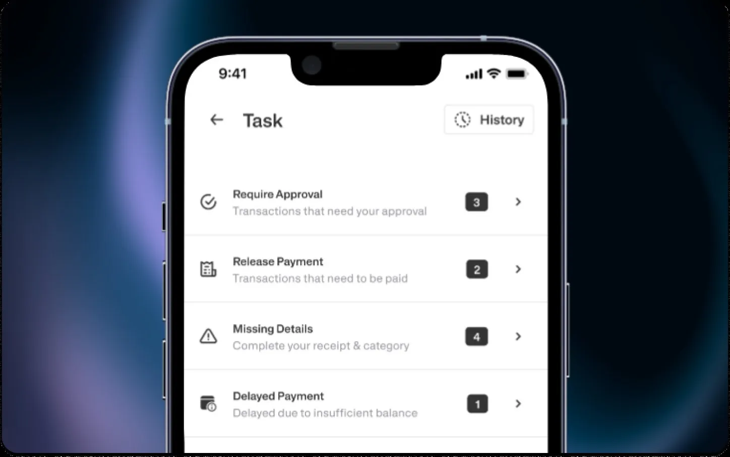
Approvals keep Jack running...
Jack Finance gives SMEs corporate cards, payroll and payments. Almost every one of those flows ends with an admin pressing approve. When approvals are slow, the whole chain from request to payout waits, and because Jack earns per transaction, so does Jack.
Requests→Approval→Payout
...but on mobile, admins were dropping off.
Our data showed admins leaving the mobile Task feature before finishing their approvals. Was it the design, the way information was shown, or the whole experience? My job was to find out, then redesign approvals so they actually got done.
So I sat with the admins who approve every day.
I interviewed 10 admins and ran usability tests built around real missions: find your tasks, approve a single transaction, release a payroll payment, approve in bulk. I wanted to know whether they knew Task existed, how they moved through it, and what they made of multi-approval.
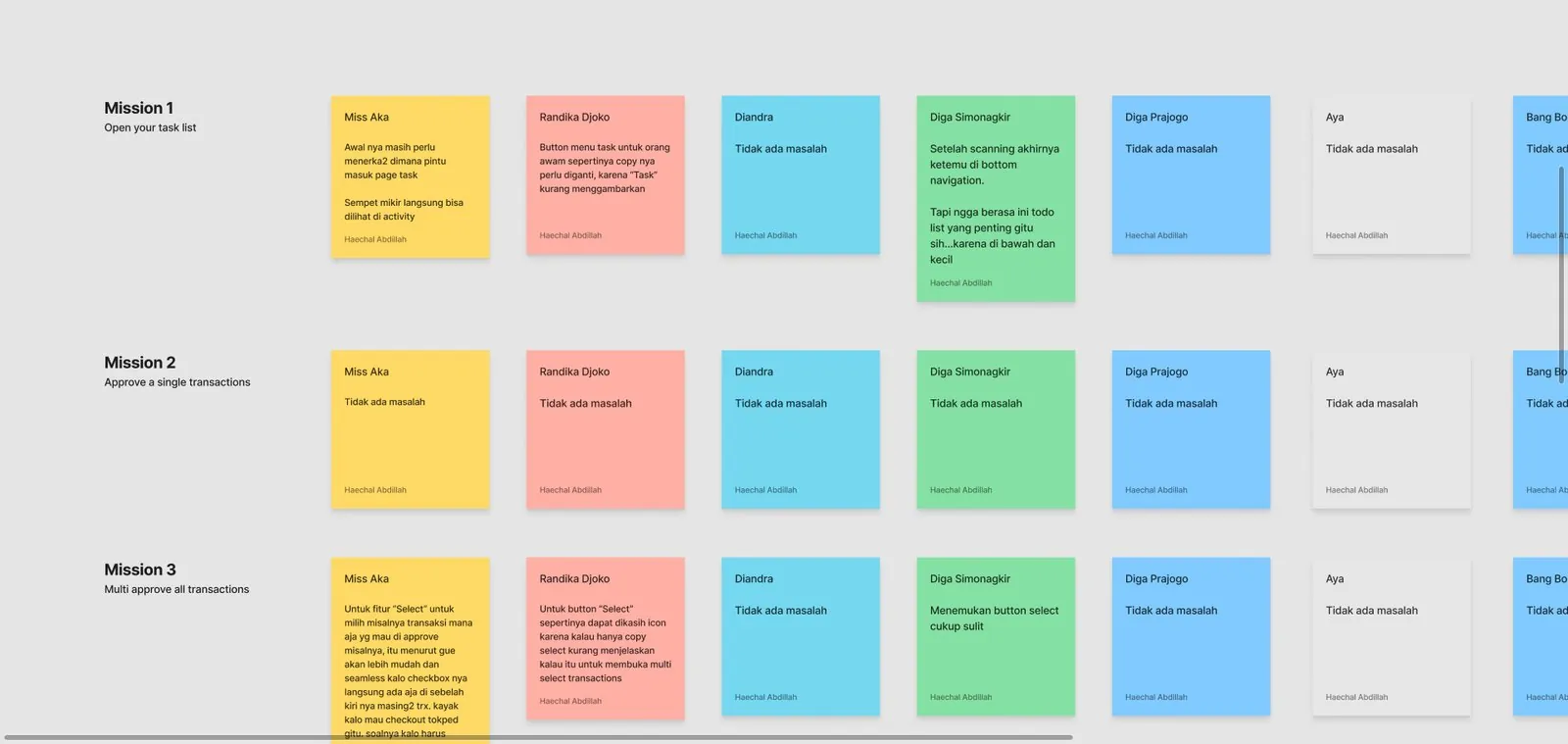
Four things were going wrong.
"Approval", "Release Payment" and "Require Receipt" sat side by side with no hint of what each one meant.
Multi-approval lived behind a "more" button. Most people never found it.
Task looked like any other tab, even though it held the work admins most needed to finish.
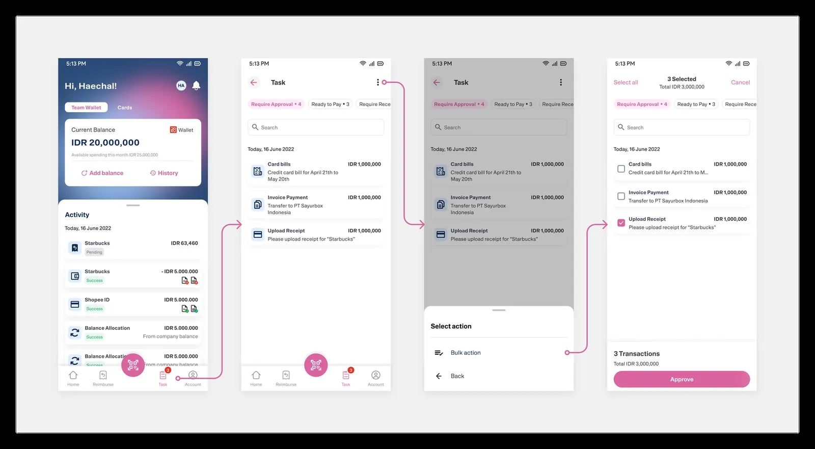
I explored where Task should live...
The project landed during Jack's B2B rebrand, so every exploration also had to carry the new visual language. I started with the entry point: how Task could earn a place on the home screen.
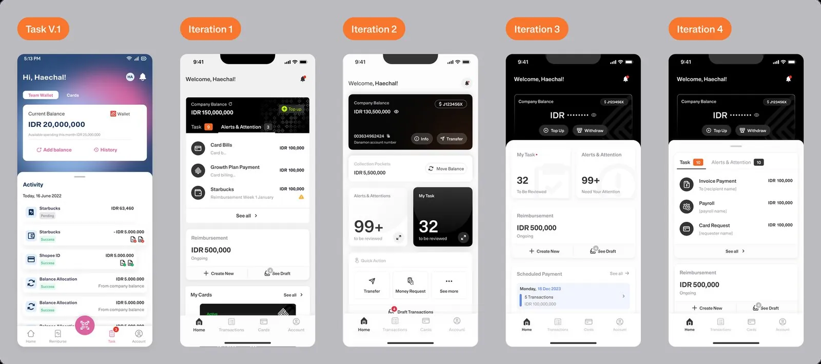
...and how the Task page should be sorted.
Then the page itself. Instead of one long list, tasks are grouped by what the admin has to do, each group with a count, so it's obvious what to do first.
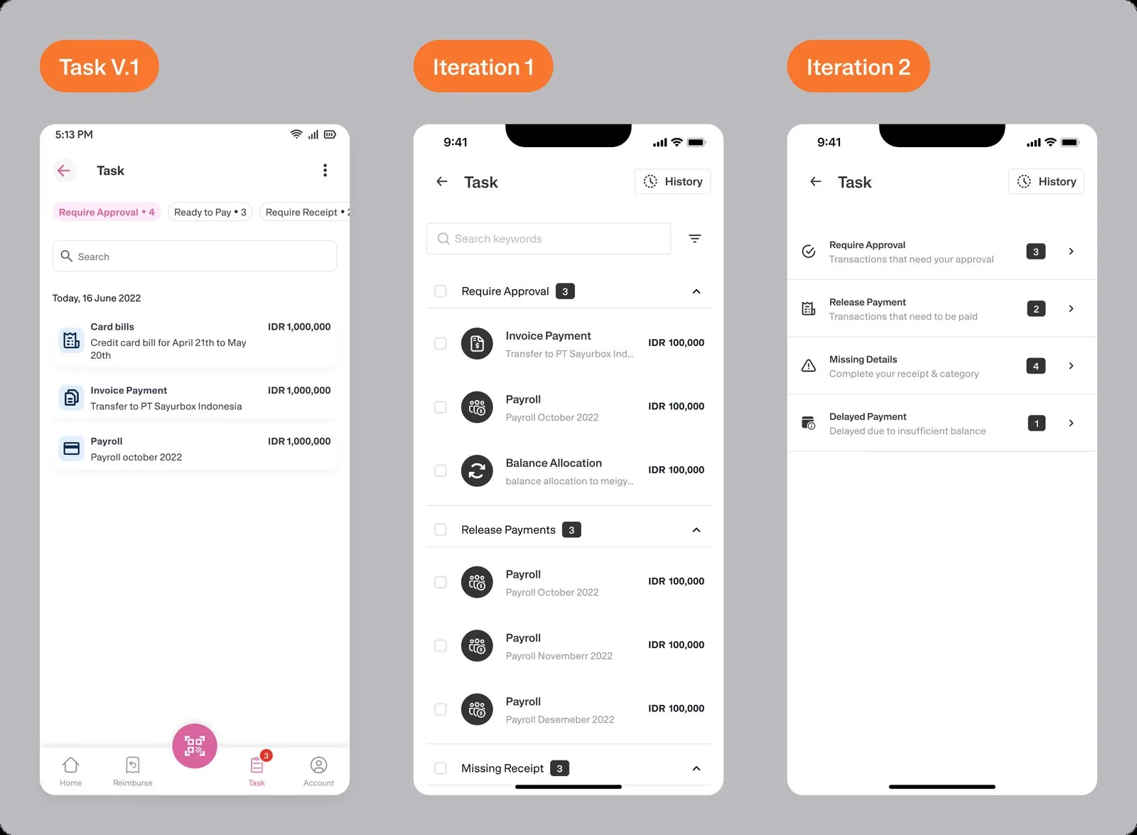
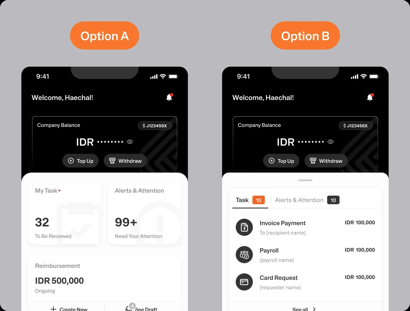
Then I let the admins choose.
Two home entry points survived. I ran an A/B test with 5 admins. 4 of them picked Option B: a short task list right on the home screen. Seeing the actual tasks made them want to clear the list straight away.
The final design
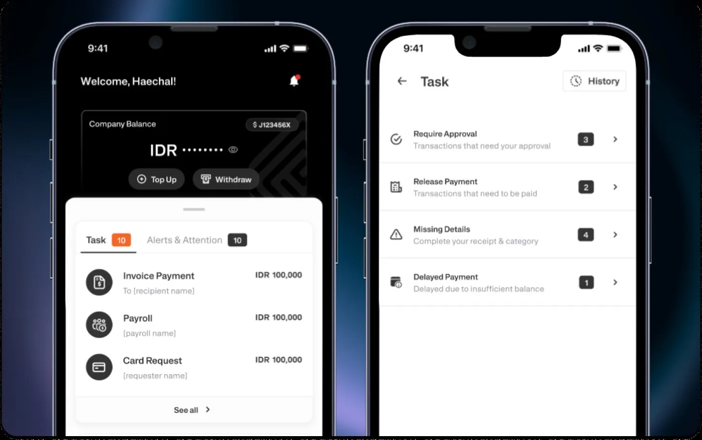
Tasks now appear on the home screen with a count, the Task page groups work by the action it needs, and approving is one clear confirm step.
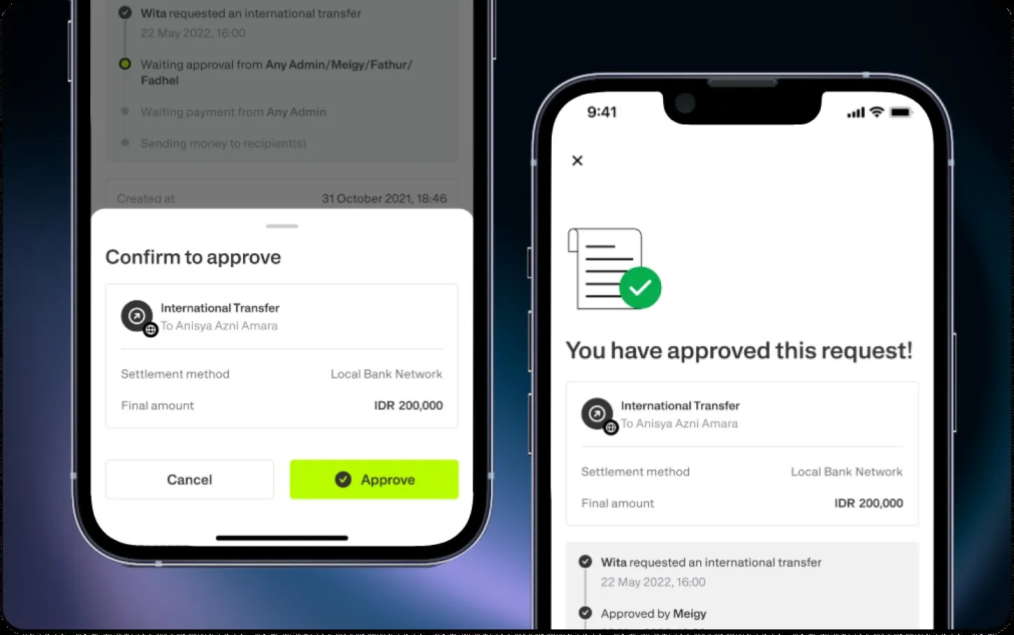
Admins started finishing their approvals.
147daily active users on Task, up from 62
60%of transactions approved in bulk, up from 10%
95%of admins aware of Task after release
90%say navigation is easy (65% found it confusing before)
"Multi-approval is a game-changer. It's so much easier to approve multiple transactions at once."
"I never realized how crucial this feature was until the updates made it stand out."
What I learned
Hidden is the same as missing
The feature worked. People just couldn't find it, or didn't see why it mattered. Placement and urgency fixed more than any new functionality would have.
Let users settle the finalists
A five-person A/B test ended a debate that more iterations alone would not have.